
Jewelry for Your Furniture. Art for Your Home
Handmade cabinet knobs and concrete art by Oregon artist Katarzyna Swenson.
Katarzyna Swenson
Sculptural Artist | Original Art Portfolio
Katarzyna Swenson | Sculptural Artist
Original Sculpture • Contemporary Art • Collectible Design
I am Katarzyna Swenson, an Oregon-based artist and founder of Sculptured Couture.
Originally from Poland, I create original sculptures and distinctive artistic objects inspired by nature, organic forms, texture, and color.
My work explores the relationship between art, material, and emotion. I believe that a sculpture should do more than decorate a space—it should inspire curiosity, create atmosphere, and become part of someone's personal story.
I welcome inquiries from galleries, curators, interior designers, art consultants, and private collectors interested in original artwork, exhibitions, commissions, and creative collaborations.
Original Art. Individual Expression. Lasting Beauty.
Introducing the first color palette, a vibrant collection of unique hues inspired by my vision and creativity. Each color has been meticulously developed and curated, showcasing distinct samples that reflect individuality and artistic expression. This palette serves as a testament to the beauty of color and its ability to evoke emotion and inspiration. Explore the richness and diversity of these tones, each telling its own story.


Introducing the second color palette, a sophisticated homage to the beauty of nature, particularly inspired by the interplay of succulents within concrete sculptures. This carefully curated collection showcases a bold mix of colors that not only captivates the eye but also serves as a testament to the thoughtful application of color theory. Each hue has been selected with meticulous attention to detail, reflecting my keen observations of customer behavior and preferences. The result is a harmonious blend that speaks to both artistry and functionality, inviting you to explore the vibrant gallery below.


Soft, airy, and quietly modern, this pastel color palette highlights the gentle contrast between industrial texture and delicate hues. Imagine a series of small concrete planters, their raw, matte surfaces softened by washes of muted blush pink, powder blue, sage green, and warm lavender. The natural grain of the concrete subtly shows through each layer of paint, adding depth and character while maintaining a minimalist feel. Together, the colors create a calm, cohesive arrangement—perfectly balancing the cool solidity of concrete with the light, soothing charm of pastels.
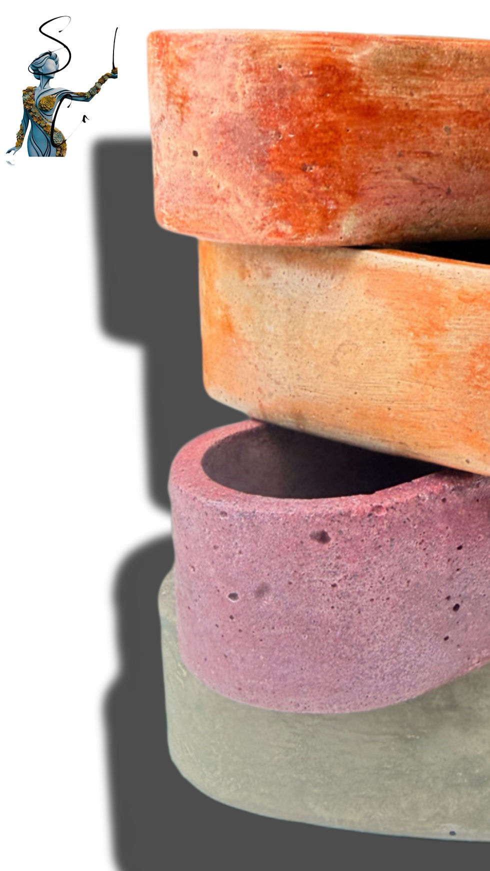


A bold, attention-commanding color palette is not simply bright—it is intentional intensity. This kind of palette thrives on high contrast, saturated hues, and unexpected pairings that challenge conventional harmony. Think electric cobalt against acidic lime, fiery vermilion colliding with fuchsia, or ultraviolet layered beside molten gold. These combinations don’t whisper—they declare.
What makes this palette sophisticated is not restraint, but precision. It draws from color theory in a way that amplifies tension rather than softens it. Complementary colors (those opposite on the color wheel) are often pushed to their most vivid extremes, creating visual vibration. Analogous colors, when used here, are not blended gently but sharpened into gradients of heat or energy. Saturation is rarely muted; instead, it is controlled—each color chosen for its role, not just its impact.
Psychologically, these colors carry strong emotional signals. Red accelerates the pulse and demands urgency. Yellow radiates optimism but can tip into agitation. Blue, when intensified, becomes electric rather than calming. Purple suggests creativity and extravagance, while neon greens and pinks evoke rebellion, youth, and modernity. When combined recklessly, these signals compete, creating chaos. When orchestrated with skill, they form a charged but cohesive visual language.
This is why such a palette is not for indiscriminate use. It requires a practiced eye—an understanding of balance, proportion, and spatial breathing room. One statement piece in this palette can transform a space, acting as a focal point that energizes everything around it. More than one, without careful hierarchy, risks overwhelming the viewer, turning intention into noise.
The true sophistication lies in its hidden discipline. Beneath the apparent boldness is a deep sensitivity to shade, tone, and interaction. Slight adjustments—a cooler undertone, a darker value, a softened edge—can mean the difference between striking and exhausting. Mastery of this palette reflects not just a love of color, but a command of it: knowing when to push, when to pull back, and how to let intensity breathe.

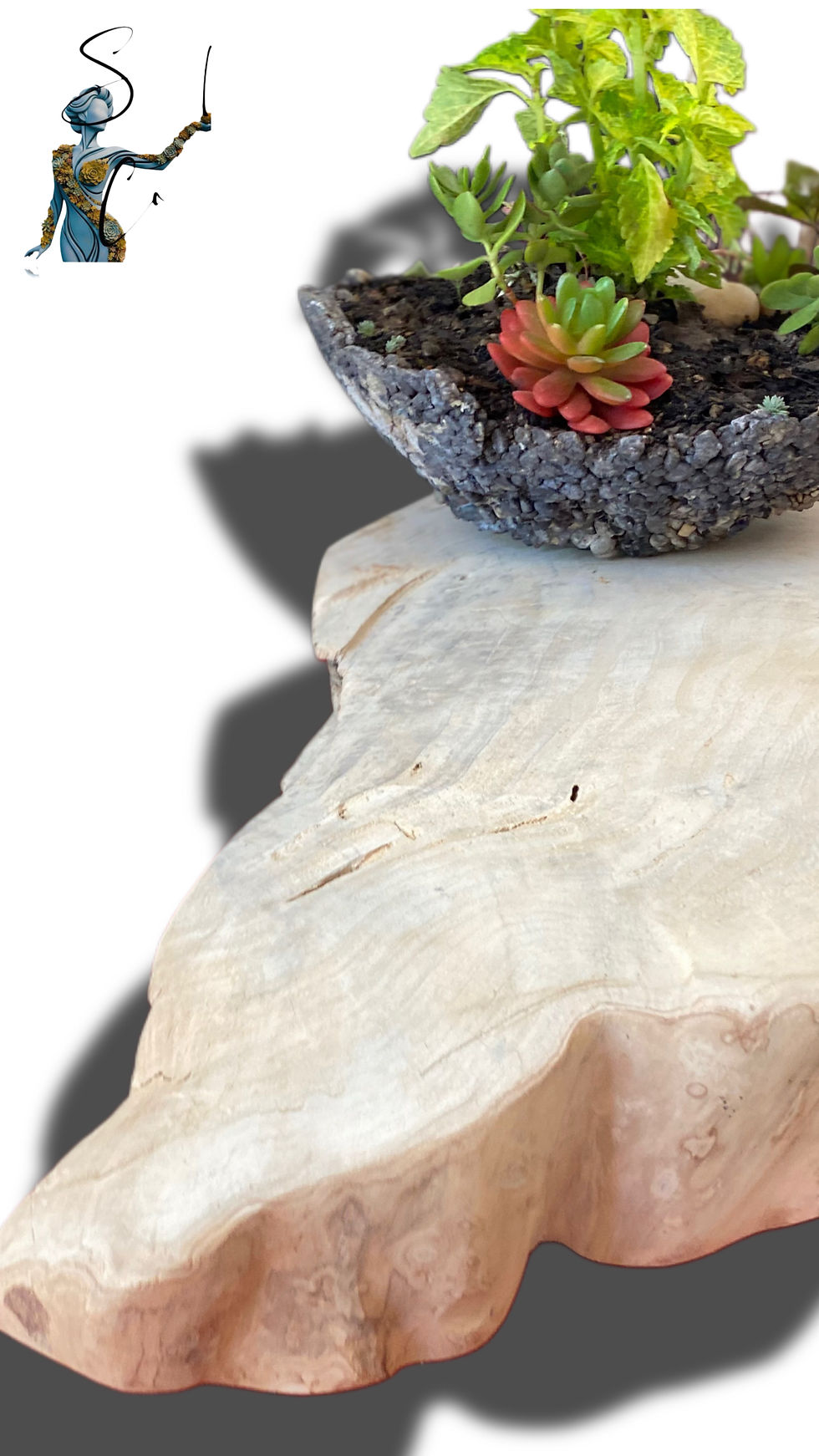


his palette exists in the nuanced space between the organic and the imagined—where natural color evolution is observed, then gently reinterpreted through a more expressive lens. Rooted in the visual language of aging materials, it draws heavily on the patina technique, allowing color to behave as it does over time: layered, oxidized, and subtly unpredictable.
Concrete surfaces become the canvas for this transformation. Through controlled applications of golds, mineral blues, and muted reds, the palette mimics the chromatic shifts seen in weathered metals and time-worn finishes. The gold tones are not pristine, but softened—leaning toward ochre and antique brass—while blues echo the quiet oxidation of copper, carrying hints of green and gray. Reds appear as traces of underlying warmth, like iron emerging through erosion, grounding the cooler tones and preventing visual sterility.
From a color theory perspective, this palette relies on desaturation, tonal layering, and temperature contrast to achieve authenticity. Complementary relationships—particularly between warm metallics and cool oxidized blues—create depth without harsh contrast, while analogous transitions ensure cohesion across surfaces. The patina effect itself is achieved by allowing colors to interact optically: thin washes, irregular coverage, and subtle translucency give the impression of time as an active collaborator.
The result is a palette that feels both elemental and fictional—capturing the poetry of natural aging while elevating it into something more intentional. It speaks to imperfection as beauty, to transformation as design, and to color as a living process rather than a static choice.


This palette is conceived as a poetic interpretation of nature—less a direct replication, and more a reimagining of how life feels when filtered through memory and emotion. Each hue is drawn from the natural world, yet subtly transformed: greens carry a luminous depth reminiscent of moss after rain, blues echo open skies but with a softened, dreamlike clarity, and floral tones bloom with a heightened, almost ethereal presence.
Rather than adhering to strict realism, the colors are calibrated to evoke atmosphere. Saturation is gently lifted or diffused, shadows are warmed or cooled with intention, and transitions between hues feel fluid—like light shifting across a landscape at golden hour. This creates a sense of quiet magic, where familiar tones take on an otherworldly refinement without losing their grounding in nature.
At its core, the palette reflects a personal way of seeing—the colors of life not as they are, but as they resonate internally. It is a balance between observation and imagination, where organic harmony meets subtle enchantment, resulting in a collection that feels both deeply natural and beautifully transcendent.


This is the most luminous collection in the series—an exploration of brightness that feels intentional rather than overwhelming. Each hue is pushed to a high level of saturation, yet carefully moderated with subtle undertones so the palette remains refined and easy on the eye. Instead of relying on pure, untempered color, the tones are gently balanced—slightly warmed, cooled, or softened—allowing them to radiate without glare.
The result is a kind of controlled vibrancy: colors that feel alive and energetic, yet composed. Soft coral leans into a sunlit warmth, vivid aqua carries a trace of gray to ground it, and bright marigold is tempered just enough to avoid harshness. This interplay creates visual harmony through contrast and restraint—where intensity is present, but never chaotic.
What makes this collection distinctive is its use of optical balance. Brighter tones are offset with quieter companions, allowing the eye to rest while still experiencing a sense of movement and light. It’s a palette that captures the magic of color at full expression—confident, radiant, and undeniably sophisticated—while maintaining a calm, cohesive presence that invites you to linger.


